
Holistic Fulfilment Redesign
Amazon Prime Now, our 1-hour local delivery service launched in just 111 days from the word “go”. This is not that story–it’s the story of cleaning up the massive technical debt it left in its wake.
When you order a product from Amazon.com, it comes from a Fulfillment Center, or FC. These are huge buildings in places with cheap rent and proximity to transit hubs and routes like Stockton, CA, Sparks, NV, and Kent, WA. When you order from Prime Now, your order comes from tiny, Urban Fulfillment Centers in the heart of the city. As you might imagine, these two environments couldn’t be more different. However, since Prime Now launched so quick, there was no time to design bespoke software for the very different use cases–they grabbed the closest-fit warehouse management system they could (Amazon Fresh’s system, which used many of the same conventions as the big FCs) .
TL;DR User experience design is all about screens, right? It turns out, in a physical space, everything a human interacts with is fair game. How we redesigned the software and much, much more.
AFT Lite
AFT stands for Amazon Fulfillment Technology. Our next-gen warehouse management system was dubbed AFT Lite. Prime Now was poised to scale and grow like crazy, and we needed a ground-up reboot of the software experience, built for small spaces and quick deployment. The sheer person-hours required to stand up a single instance of full-strength AFT could literally justify the cost of our project.
Research
We started with a deep research project. My team (me, a product specialist, and a junior UX designer) visited two live Prime Now sites, and observed the launch of a brand new one on a week and a half long trip where we collected over a hundred hours of direct observations from dozens of associates, managers, pickers, packers, and sorters.
When we got back, we colated our observations into an epic research wall, spanning 40 feet of hallway with observations and opportunities for improvements.

AFT Lite and the case of the corporate underpants
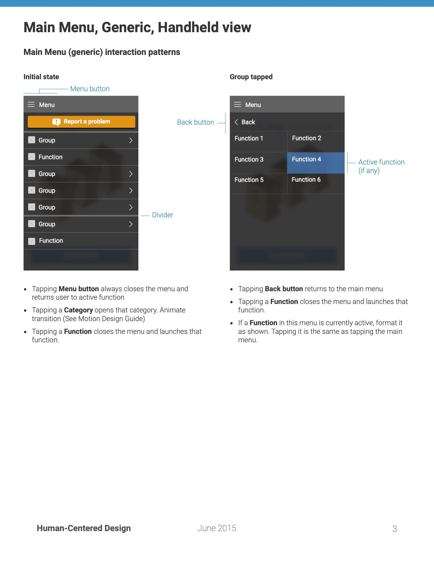
Looking at the wall above, suffice it to say that we had plenty of opportunities for improvement. However, the biggest takeaway was that the AFT Lite software was just the beginning. Everything–every process, every tool, every piece of software–was the way it was because whoever was in charge of the decision made it in a siloed vacuum. The components were all striated on organizational lines–our corporate underpants. Nothing fit together, nothing interoperated, and the data barely made it from one process to another. Worst of all, it could not be clearer that whatever factors influenced the final decisions, user experience wasn’t one of them.
The prettiest darn fulfillment center software ever
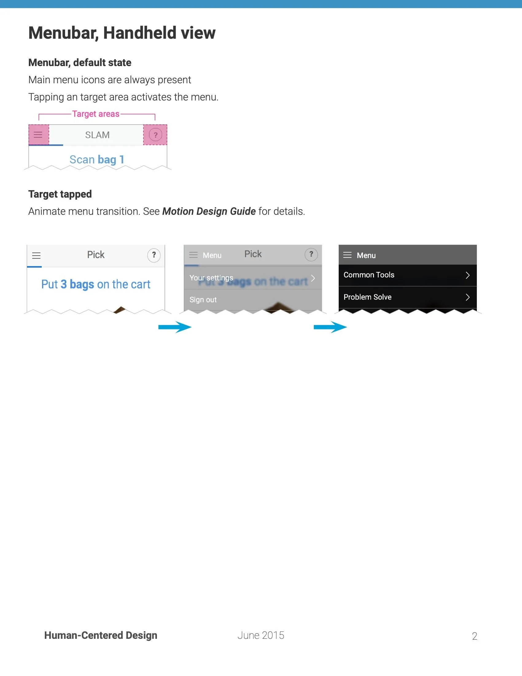
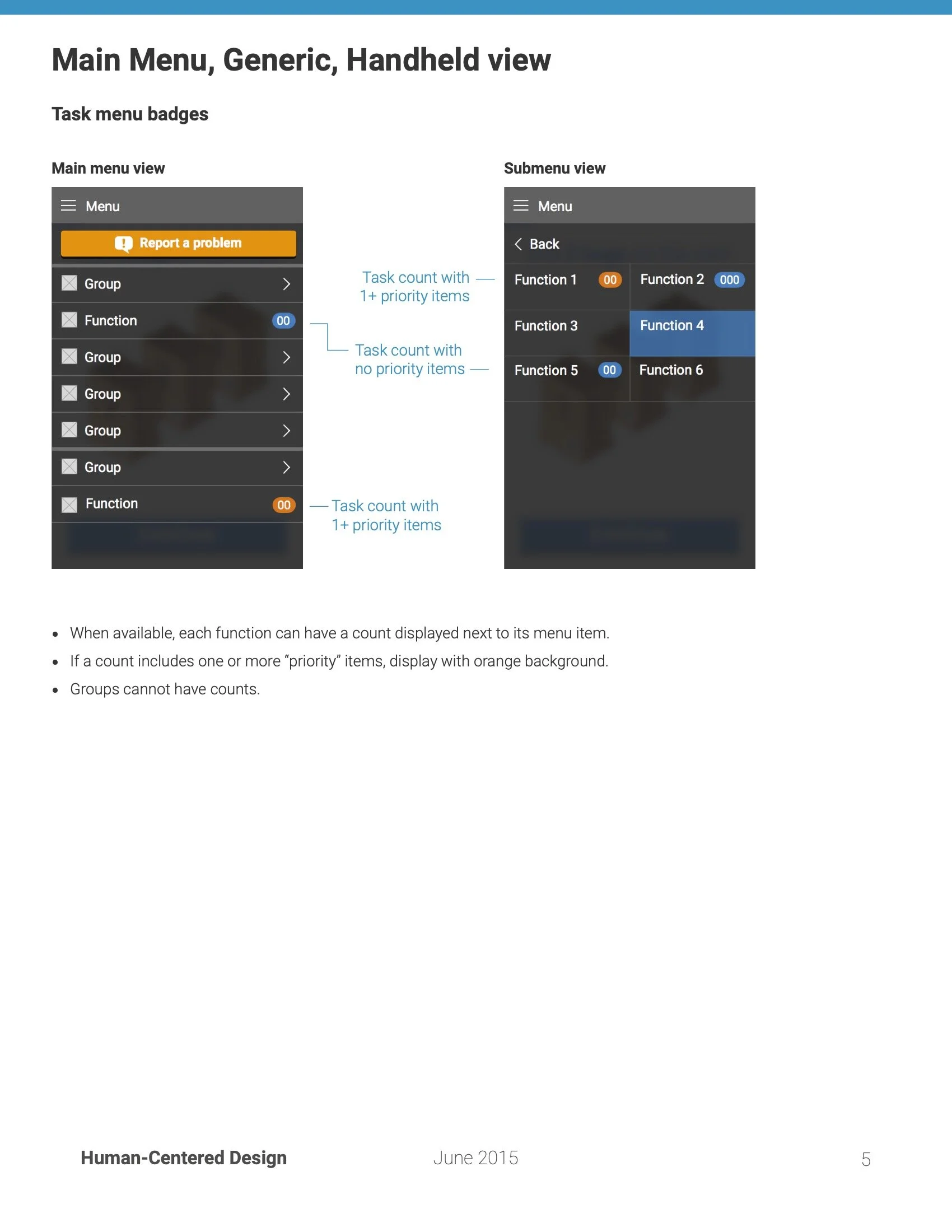
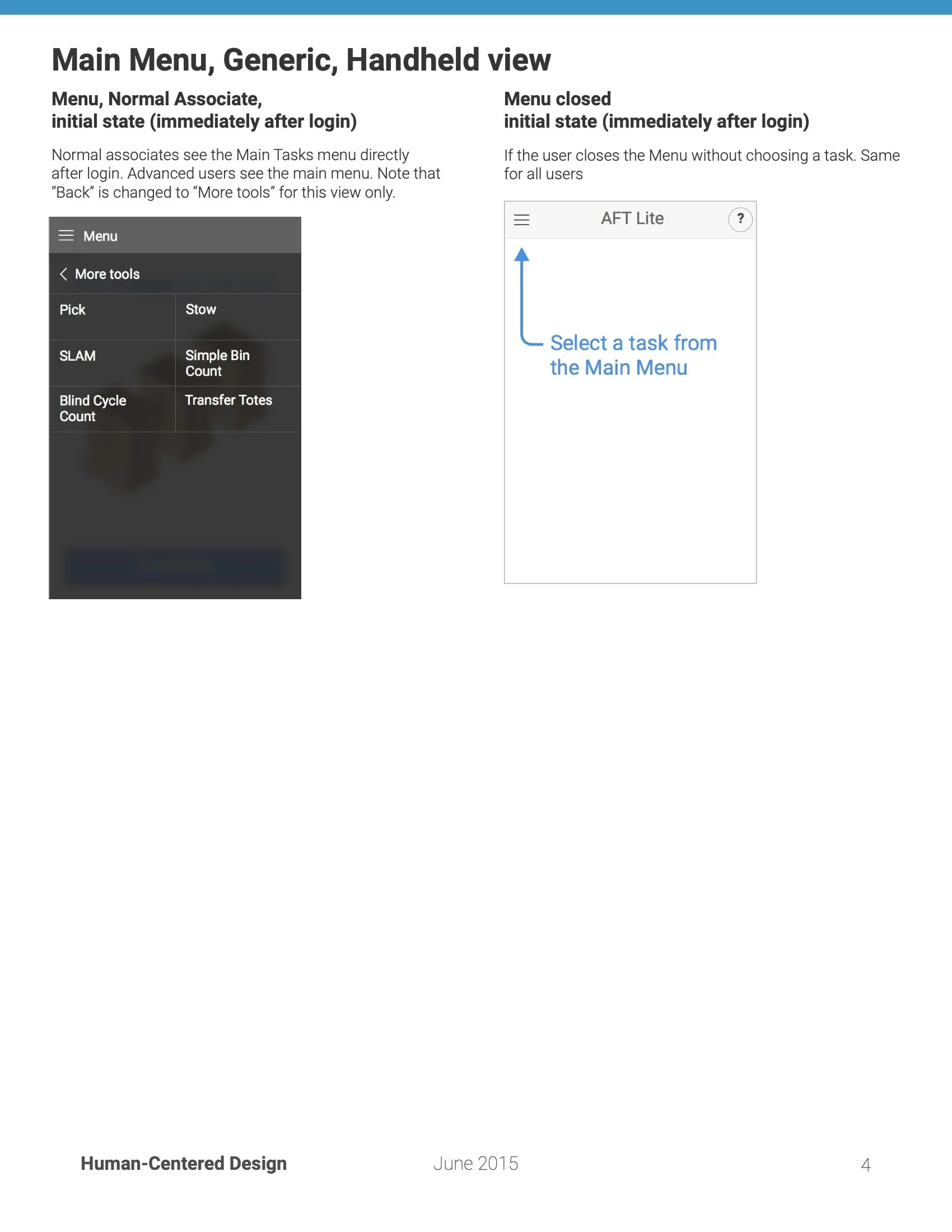
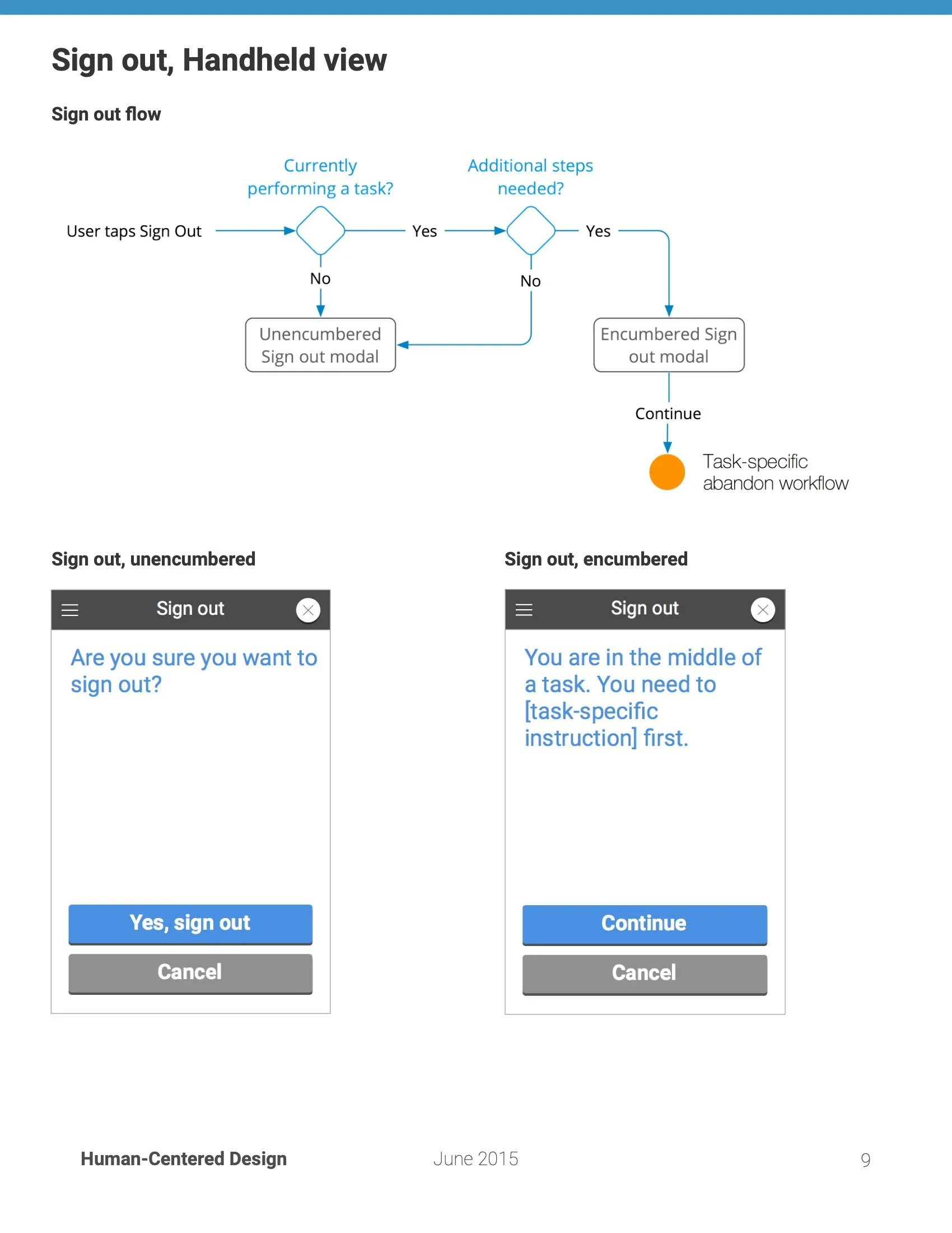
First things first, we did actually need to address the fulfillment software first. Fulfillment Associates tend to turn over relatively quickly, with many leaving before a year. One of the biggest problems we identified straight away was that the existing software gave only the very least information available. The screen to the right is what the old experience looked like during a “pick”. (Go to a location, and get the item.) Yeah, for real.
This was our first big opportunity to de-underpantsify the fulfillment experience. We made a tenet that dictated that what we show on the screen must match what they see on the FC floor.

The old software. No, really.
We took a consumer software OOBE (Out of Box Experience) mentality. Even though associates gain hundreds of picks in their first week, it can take a month to get to an acceptable speed. If they run into a problem, they need to seek out and ask the floor’s Problem Solver, a dedicated troubleshooter, which dragged down productivity of both.
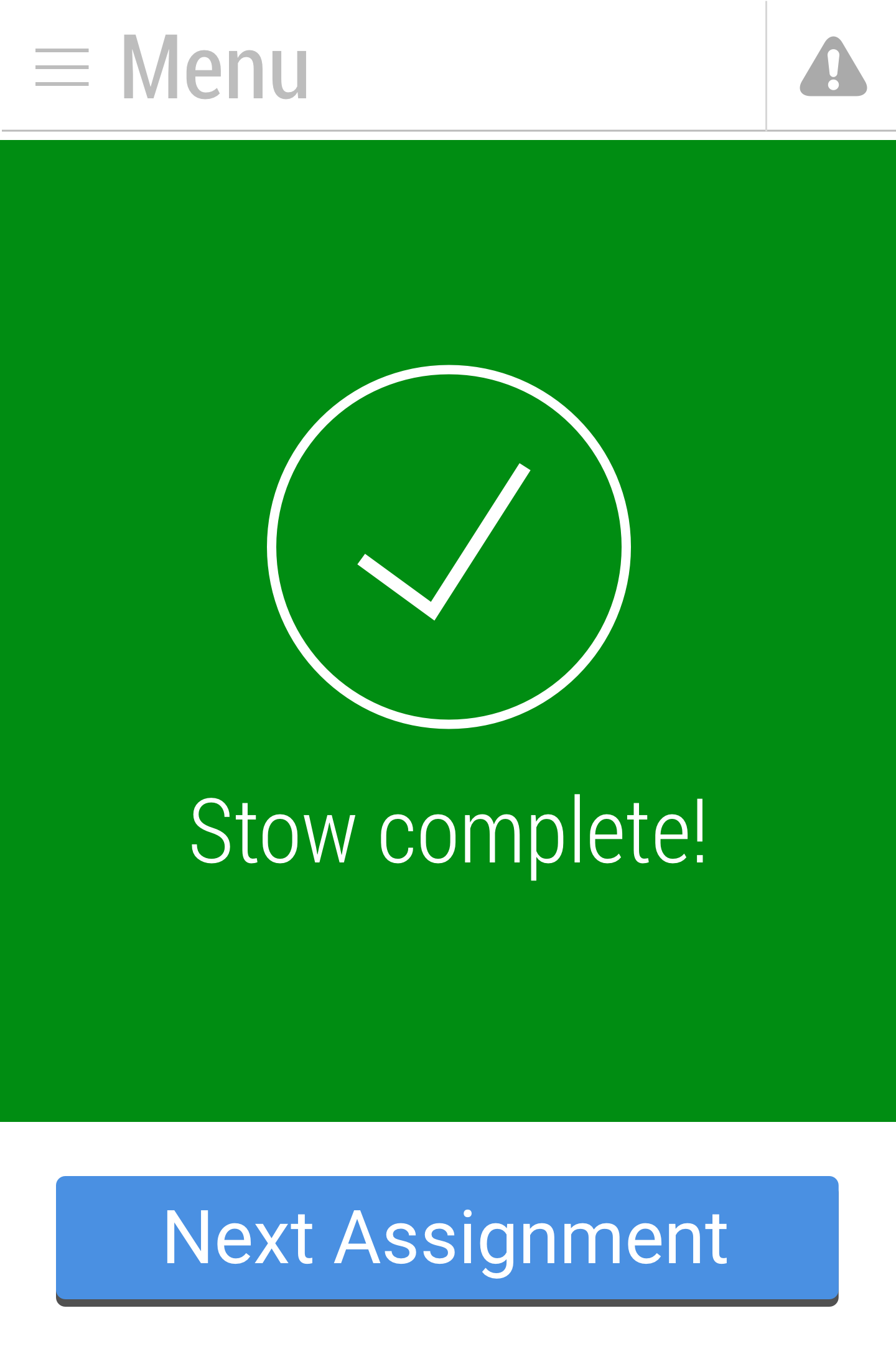
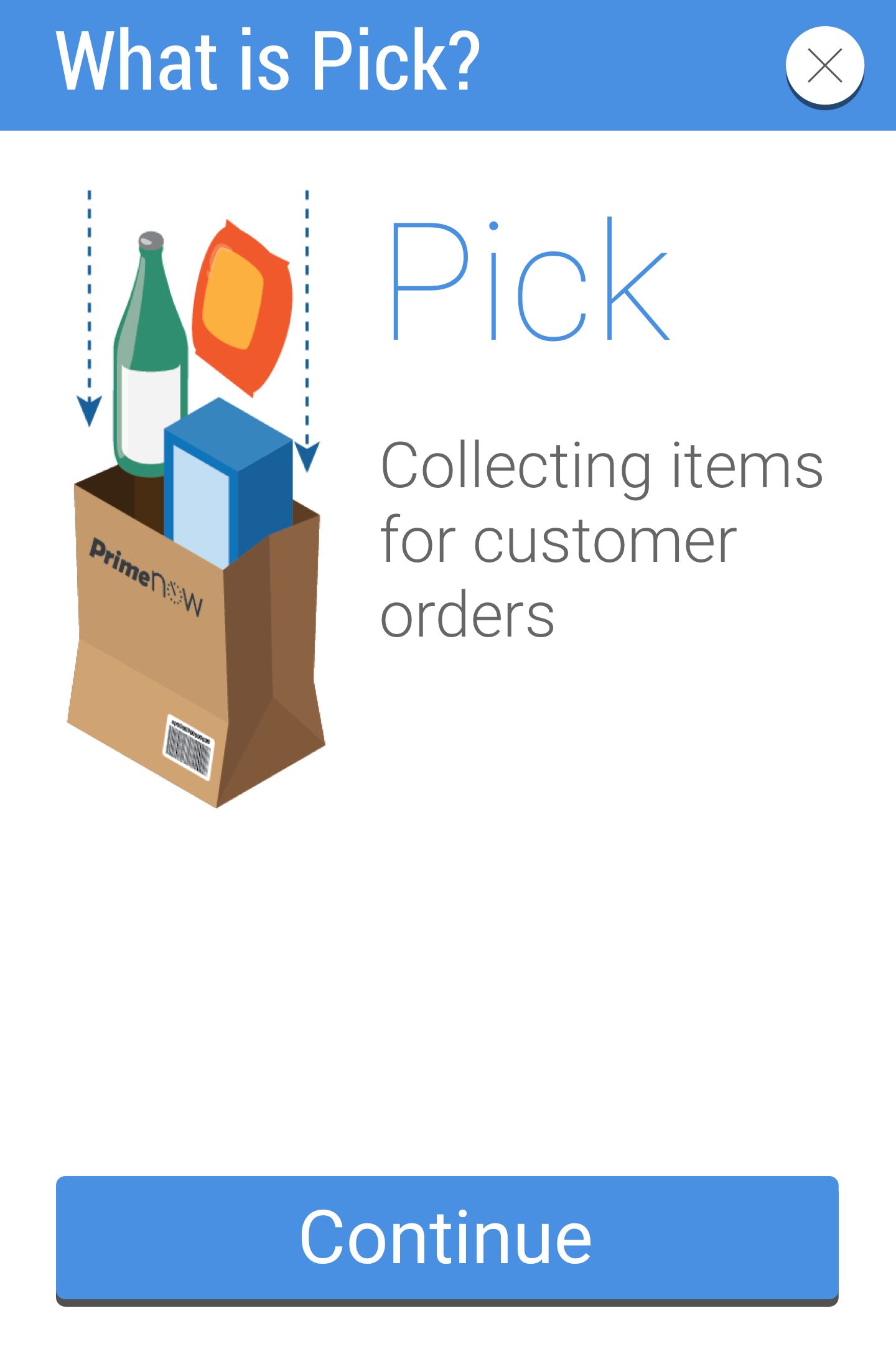
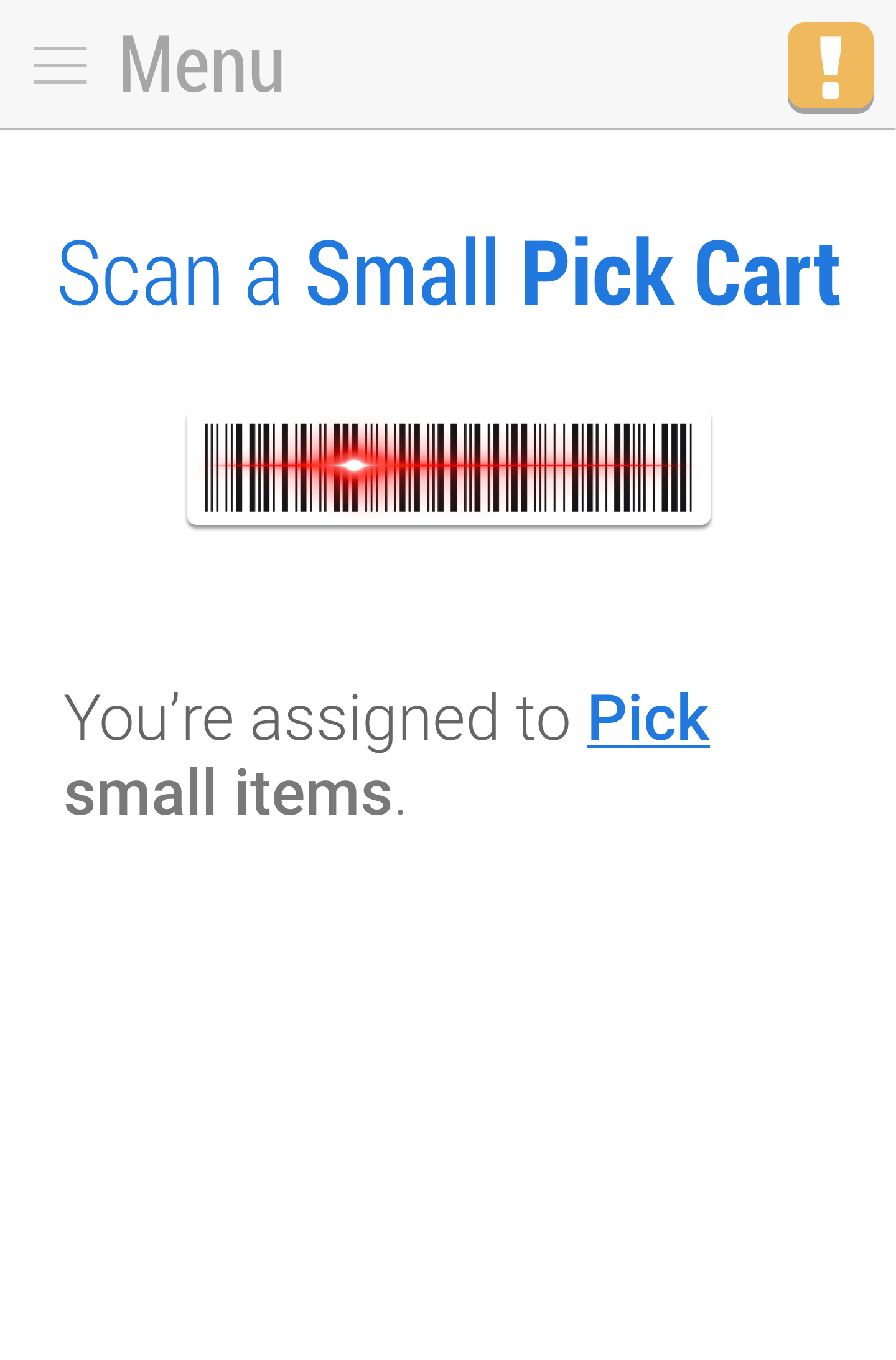
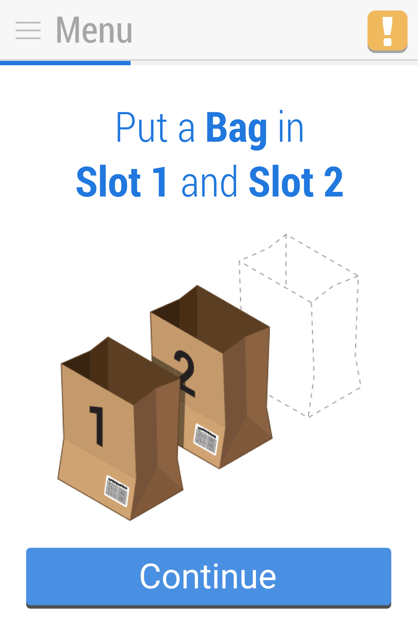
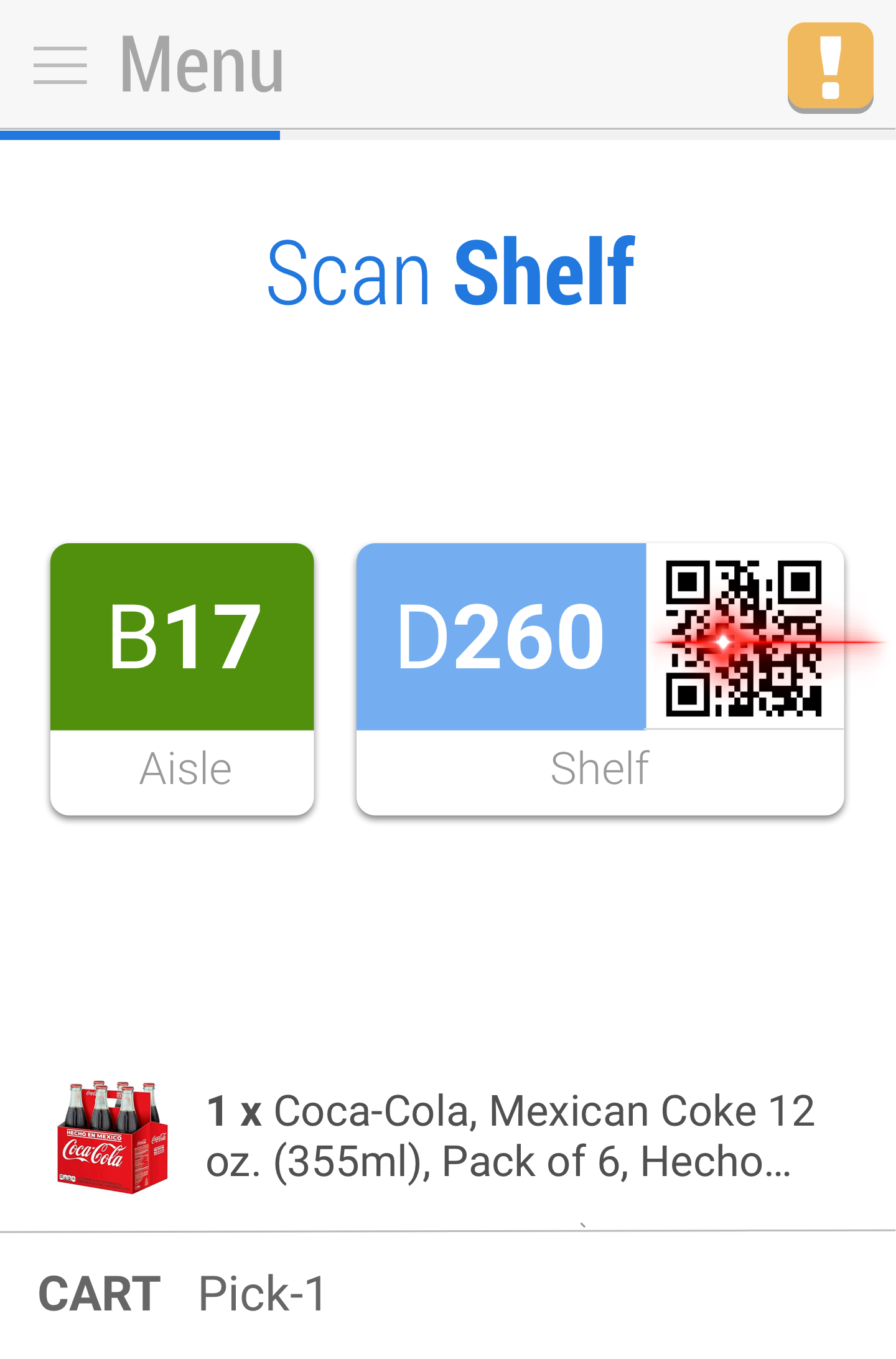
We created a visual-first system that didn’t need to be read to be understood. In addition to being obviously more user friendly, it’s a reality that some of our associates aren’t the best readers, and many don’t speak English. Below is a simplified version of the login and cart setup flow for Pick. We started with a common “scan” icon, which was a large majority of the actions an FC Associate needed to do. That’s the red laser graphic. We then show a representation of the containers they need to look for, which are bags at this site.
Product images
For a company that literally serves billions of product images to millions of customers a day, you would think that providing those same images to the people actually retrieving the items would be easy, but thanks to corporate underpantsification, that was far from the case. Part of the problem was latency and wifi coverage within the warehouse. However, we were able to get around that issue by pre-caching images when a picklist comes down to the device.
Then there’s the issue of completely disconnected systems. That information just wasn’t ever meant to be readily available to the FC system. This required a non-trivial investment, but it was worth it. As a bonus, we also got un-truncated item names, which can help when the image alone isn’t enough.
Look at the example below. Assuming you don’t already have an idea of what Emu Oil looks like, which would help you find the right item?

User testing
We wanted to get back out into the field as quick as possible to validate our designs. The problem was that in order to test a working prototype in a live FC environment, we’d need one heck of a fancy electronic prototype. Our main workflow could largely be linear, but we’d need to pop in exceptions, and change the flow. The workflow also had so many pages, there’s a high likelyhood we’d break our prototype while editing. So we faked it. Like, really faked it. We used a paper prototype (with Levenger Circa discs so pages could be bound together, but easily reordered and added) and rubber banded it onto a scanner.
Words can’t express how janky it all felt–but it worked shockingly well. We were able to come back 3 weeks later, saving the time we would’ve wasted coding, assembling, and troubleshooting an electronic prototype. We were also able to iterate in the evenings, print at Kinko’s and have a brand new test ready in the morning.
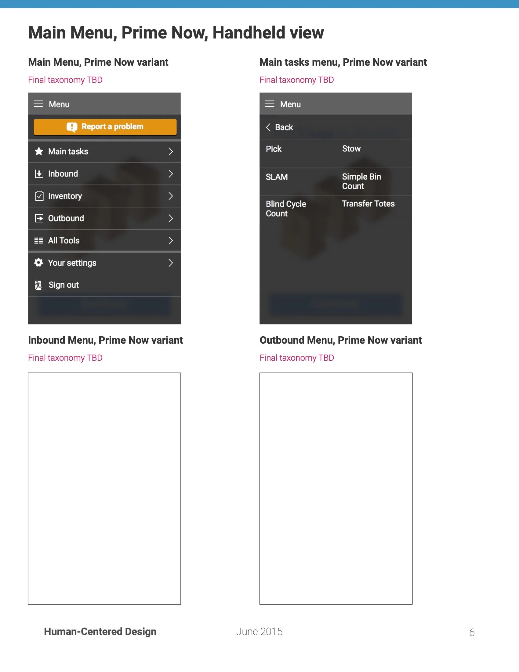
I’ll move onto other phases of the project, but below you can see samples deliverables for AFT Lite’s scanner software


Location, location, location
After we locked down our MVP, we started looking at what our next highest priority was. The thing FC Pickers spend most of their time doing is walking to their next location. This is expressed in an alphanumeric bin number that directs you to the shoebox-sized prism containing the item you’re looking for.
For example:
A126 G412
The first number, A126 is row you need to go down. Depending on the size of the facility, the row may be broken into several blocks, starting at 100. That number is the 6th character, so this bin is in the 400 block of row A126. Sound confusing? Even veteran pickers agree. Picks are ordered sequentially by row, so it’s actually rare to skip rows. That means that the information is fundamentally out of order, and the most important figure is buried.

Given the bin number A126 G412, would you turn left or right here? It’s not uncommon for experienced associates to make wrong turns.
I would love to tell you we fixed this for the whole system, but unfortunately changing the schema would mean changing signage for every bin and every row of every FC worldwide plus readdress the bin locations digitally on every system. There were definitely some challenges outside our merry band’s reach.
What we could do, however, was leave the numbers alone but change the aisle markers at the FCs we were working with, as an experiment. We changed the color of each of the aisle signs to match the 6th character–green for 100s, purple for 200s, orange for 300s, and blue for 400s. We then color the first grouping of bin markers with that corresponding color. (The second grouping is colored for the z-level location of the bin.)


Aisle color samples, redesigned with accessible color scheme and non-color affordances.
FC map with sample signs.
We ran a limited test simulation using a small section of shelves. Using a low-fi (paper-based) prototype, we challenged associates to scan 50 bin locations as quickly as they could–once using the old monochrome system, and again with the color system. I can’t share the exact results, partially for trade secret reasons, but also because, while rigorous, there are a number of factors that we couldn’t or didn’t control for. That said we demonstrated a fairly strong effect on location-to-location speed for novice pickers and an effect about half as strong on veteran pickers who were already familiar with the building.
Unfortunately, due to timing with Prime Day, we couldn’t roll this change out before I left the group, and the logistics for even a single FC contained experiment was higher than the team could support. This part of the initiative was paused.
Scanners, carts, and breaking bottles, oh my.
We took pride in expanding the definition of User Experience from “things with screens” to “everything a human touches”. You may have noticed the old scanner interface has a square, low-res screen while AFT Lite is shown on smartphone screens. A big part of that is because my team was a strong advocate for changing to newer, more powerful hardware. Durable as they were, the Motorola 3100 scanners had terrible screens with massive color shifting at almost any angle. We partnered with Cognex to trial a new device that actually used a smartphone inside of a scanner grip. I even built a testing rig out of Legos to test battery life and duty cycles!
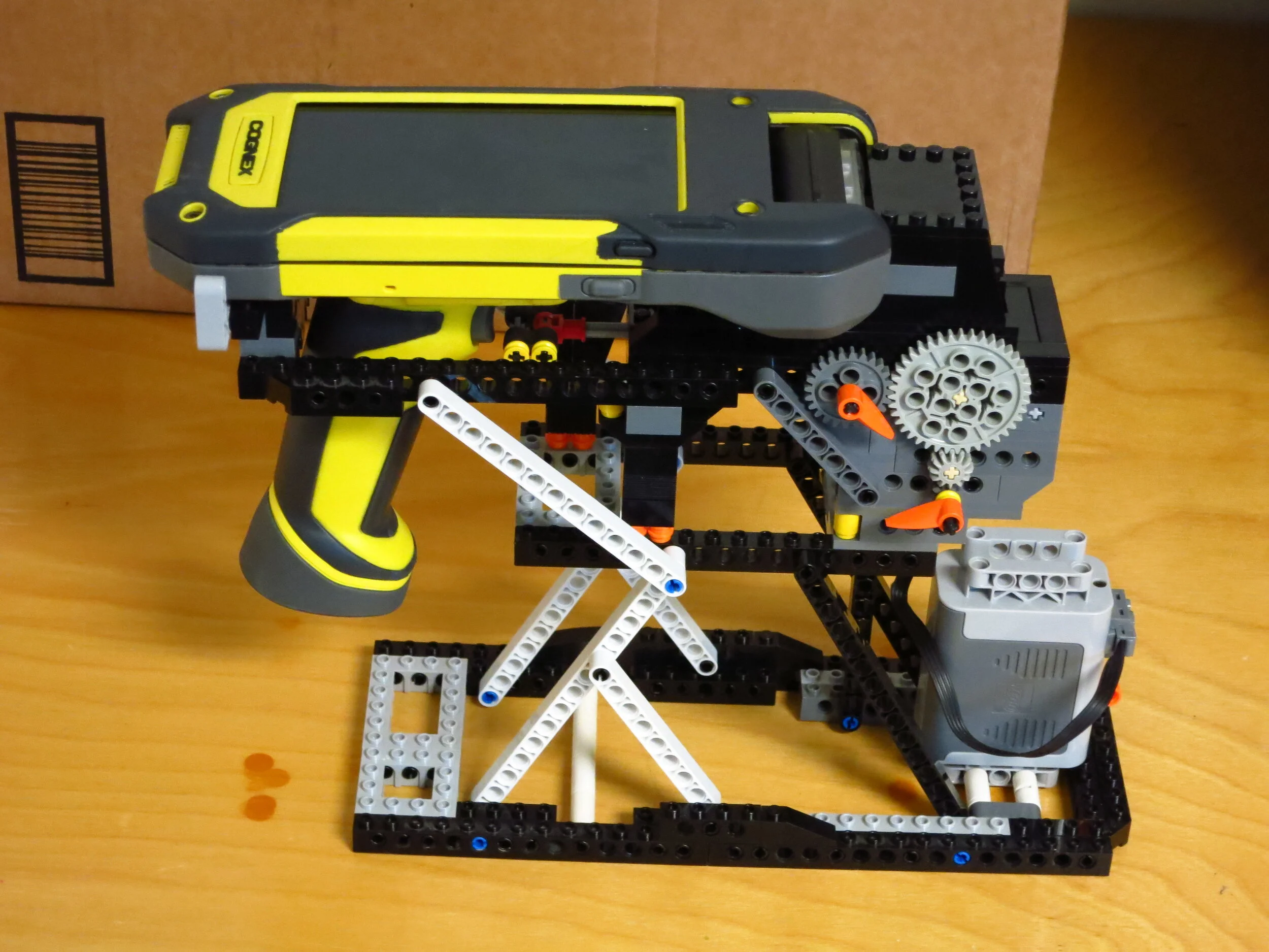
We didn’t end up selecting this particular model–partially because of the test results from my rig–but we did successfully make the case for an upgrade in general as a result of our work.

Carts, not scanners, are actually the most-touched piece of equipment in the FC. Above are 3 types of carts used at Prime Now FCs, Pick, Stow, and Support. The problem is that they’re never all in use at the same time; Stow carts are deployed at slower times of day, but would be in the way of the pickers, and support carts are deployed as needed. Additionally, in some urban FCs, space is at a premium. JFK11 in New York is actually converted from an office a few blocks from the Empire State Building! We set out to build a modular cart that can be reconfigured to accommodate all 3 functions.
Our design was a very successful failure! We did a test production run using 80/20 extrusions (a fast-construction standard FCs use for prototypes) and learned a lot. First, the modular carts solved the problem they were designed to–they replaced all 3 cart types, and even alleviated constrained pick cart supply during busy times. This freed up space for rows of shelving, which would increase the FC’s capacity. Unfortunately, we found that the dividers for Pick Mode and tops for Stow and Supports were lost or thrashed in a matter of months. However, it gave the production team enough data to assess the nominal value of combining the carts and gave them requirements for a manufacturer to design carts with movable-but-durable-and-not-loseable dividers, which was the goal of the experiment.

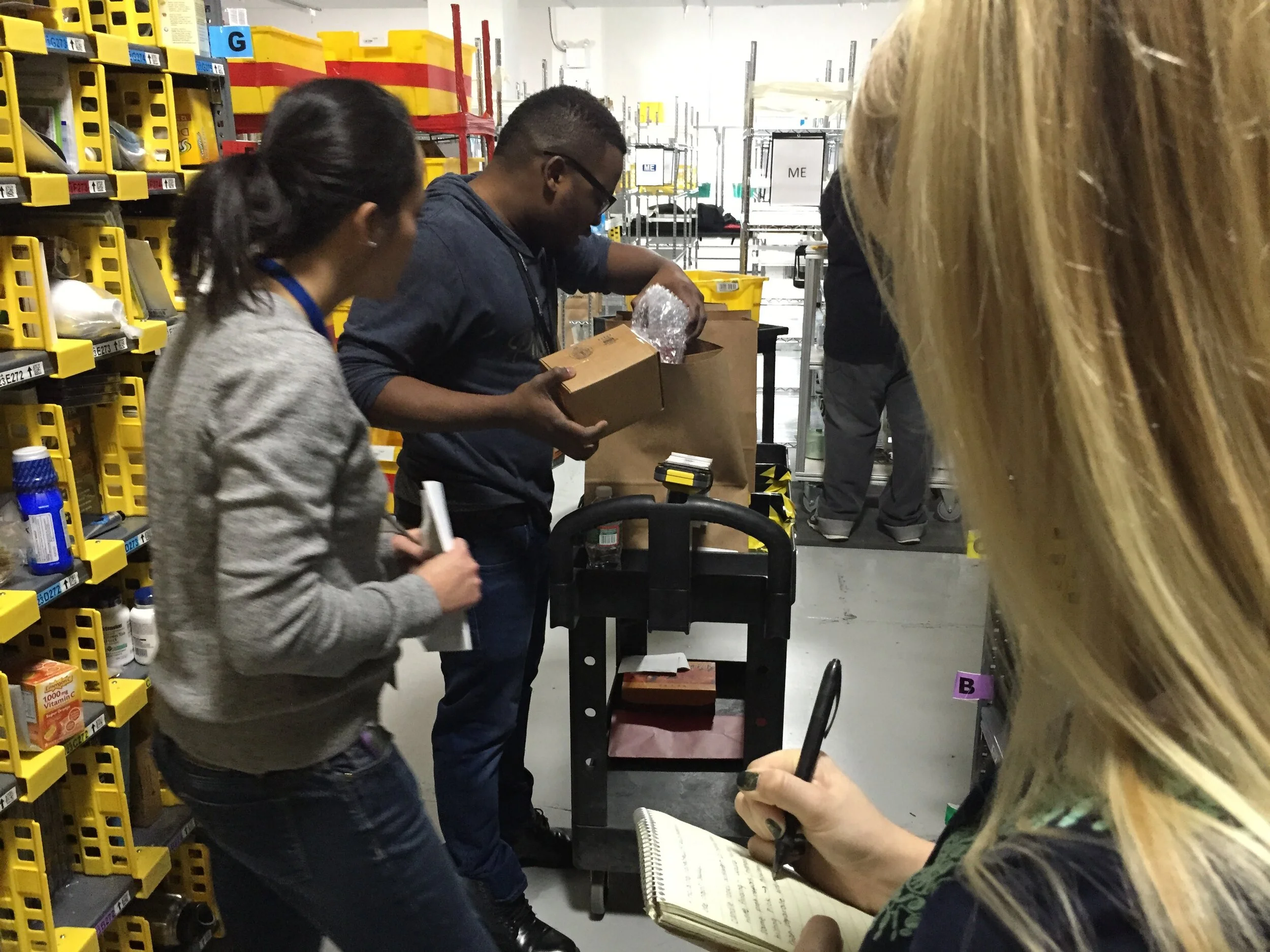
I’ll let you in on a secret: people really, really want Perrier in one hour. Sparkling water and a bunch of other glass-bottled drinks are extremely popular on Prime Now. The problem is that orders are packed into paper bags, which don’t offer a ton of protection. The bottle break rate was significantly higher than anticipated, and we were tasked to find out why.
We started with trying to replicate bottle break conditions. We carried bottles in all kinds of configurations–with other bottles, alone, with other heavy items, walking miles of Seattle streets, carelessly knocking bags into benches, bus doors, and corners. I even put a bunch of bottles together and rode over railroad trestles on my bike. In retrospect, we must’ve been quite the sight. But try as we might, we couldn’t quite get a bottle to break naturally.
Attempting to break bottles via real-world testing
Finally, we decided we should figure out exactly what could break a bottle. I wouldn’t call this a scientific test–there are plenty of uncontrolled variables, only one sample per result, and no peer review–but it was enough. I constructed a rig out of 80/20 that swung one bottle into another. It took 40° of swing at 18 inches to break a bottle. Suffice it to say, side impact is probably not our culprit here.
Bottles are surprisingly hard to break via side-impact.
Still, we wrapped up our test using a variety of commercially-available and homebrew bottle protectors.
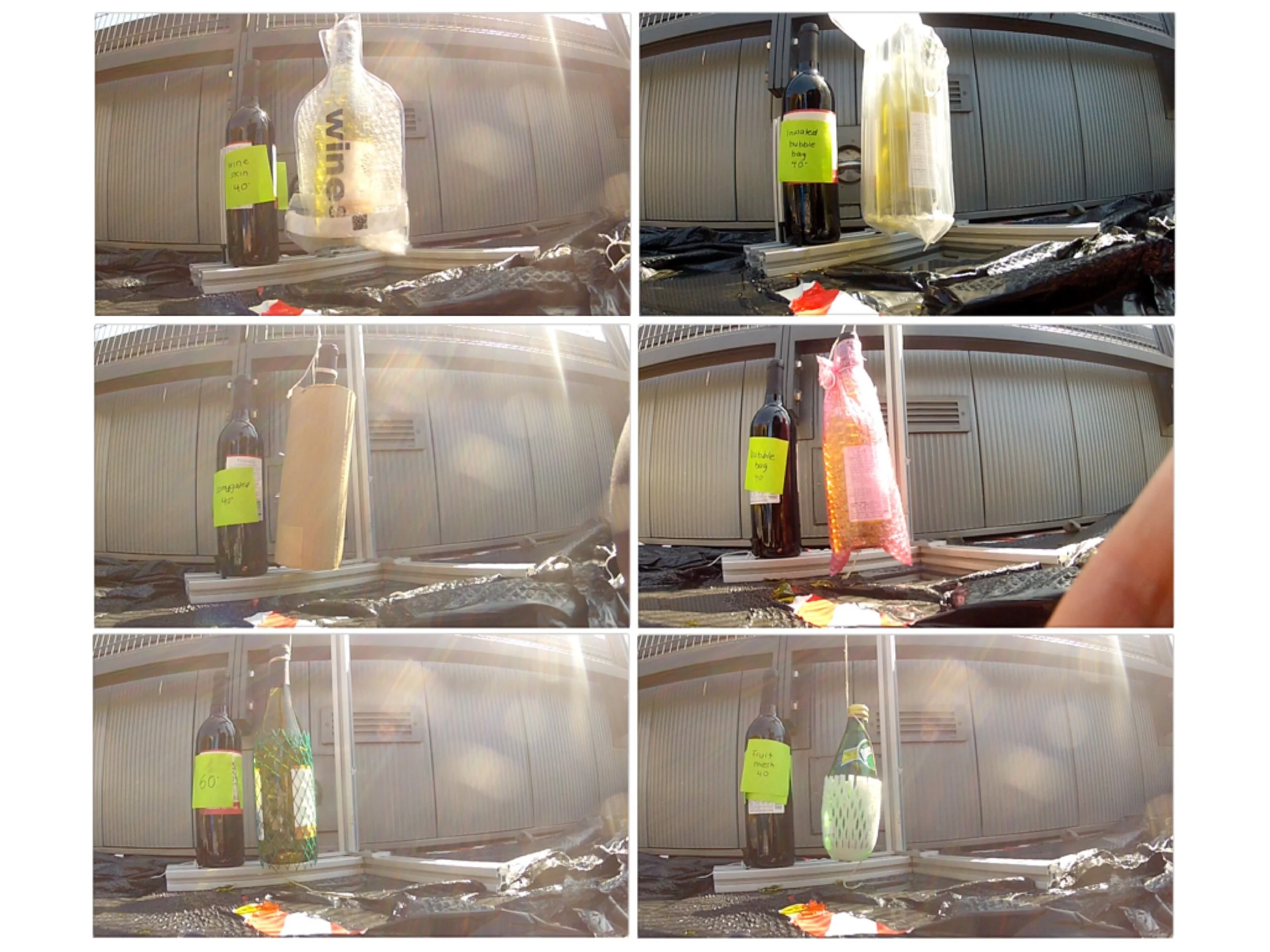

We had an alternate hypothesis–one that some delivery agents were skeptical of–the bags were being dropped and the bottles take the hit. Sure enough, all it took was a fall from 10 inches to break a bag-only bottle.
The good news is that we didn’t have to look far to find a cheap and easy solution. A simple corrugated cardboard panel (e.g., a slice of box material) at the bottom of the bag is all it takes to prevent a break all the way up to 25 inches, about where a bag carried at resting height would be. As you might imagine, we’re somewhat familiar with courrugate. Not only is it cheap, but it’s operationally cheap to implement–no special storage for protectives, no scanning issues, and the bags are easier to carry! It’s safe to say that saving wine from tragedy is some of the most important work of my career.
